Baton Design System
Maintaining a symbiotic and interdependent relationship between teams through the component alignment.
Project length
2 Months
My Role
Lead Product Designer
+
Each year, I prioritized the update of our company wide design system for our team. This design system consisted of several elements that would maintain a 1:1 relationship with the developer components that existed in Storybook.
Colors
A color palette is not just about aesthetics; it’s a strategic asset that enhances brand identity, user experience, accessibility, emotional connection, market differentiation, and design efficiency.
This color palette was maintained in collaboration with our design and engineering team. In 2023, I made it a personal project to integrate this palette further by implementing it using Figma’s new variable system.
Icons
Icons are integral to any design system. Maintaining a 1:1 relationship between the design system's icons and the engineering team's component library ensures consistency, efficiency, and ease of maintenance. This alignment is crucial for delivering a cohesive and high-quality user experience across all products and platforms.
At Baton, I was solely responsible for the maintenance and updating of our 120 icons that made up our icon library, each with their own variations and theme, all built in Figma.
Typography
Consistent typography is crucial for the purposes of readability, usability, brand identity and accessibility.
Although there was little change in Baton’s typography from year to year, with the update of the design system 2023, I was able to better hone my skills in Figma by utilizing the Figma variables functionality with our typography in addition to our colors.
Buttons
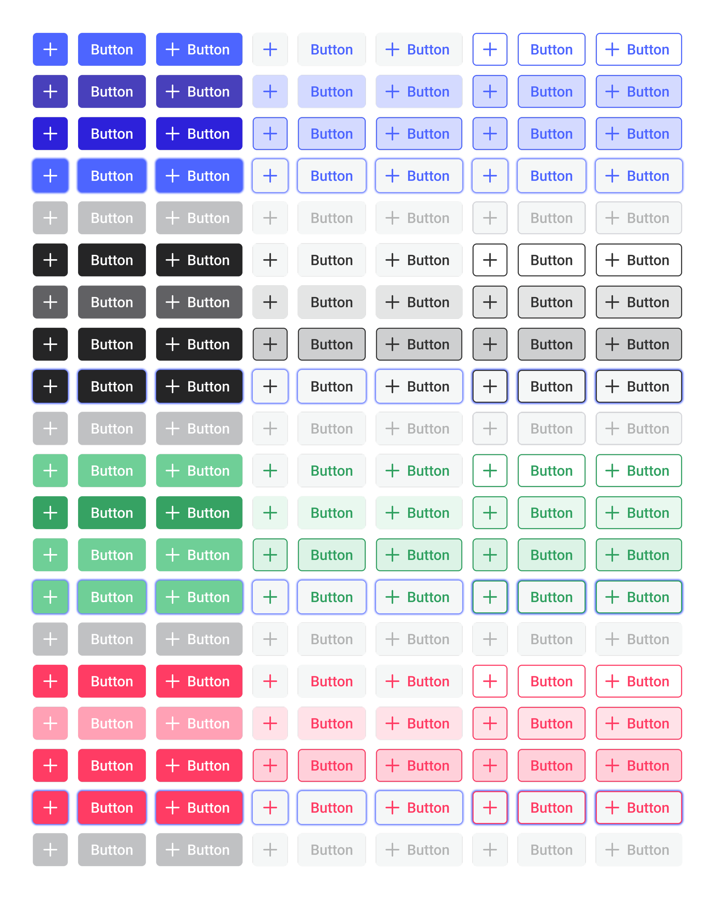
Aligning the button library between our design and engineering team was a crucial investment in the future of our company for many reasons. This would ensure consistency in appearance for the Baton brand and project, as well as enable easier maintenance by enabling the reuse of components and streamlining the design-to-development handoff.
This particular year, I aimed to streamline our system in Figma by decreasing the number of physical components through use of more robust variants and instances.
2022 Design System - 410 Button Components and Variants
2023 Design System - 260 Button Components and Variants
Other Components
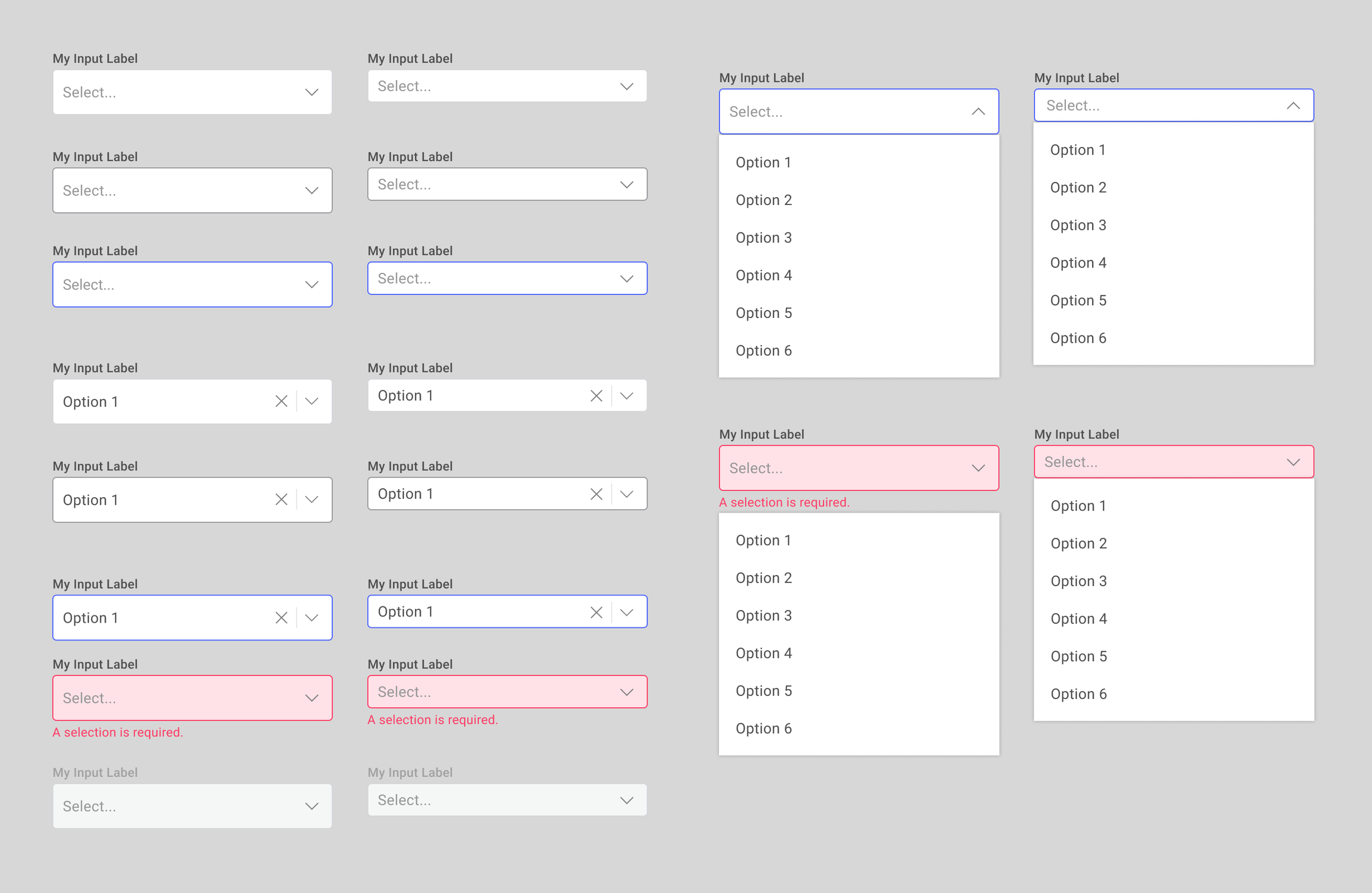
Other components in the design system consisted of things like selects, menus and lists.
The design system developed in 2023 consisted of 16 additional styles from the previous year and utilizing more of the advancing functionality in Figma.
What I Learned
-
Take the time to do it right
It’s possible that in a lot of cases during this process, it might have been easier for me to move forward in building out the system without actually improving how it worked but within a few months, the impact of a well-crafted design system showed for itself.
-
Understand how others work too
In improving this system, I was aiming to improve my workflow as well as that of our engineering teams. This would have all been for nothing without taking the time to learn their process and how I could help to improve it.
-
Get Your Team on Board
This project was surely made more impactful by bringing members from all teams on board and ensuring our product brand was aligned across teams. By bringing members on early, we also brought in new perspectives and made the system usable to all.


